readium-css
Inject and paginate EPUB contents
[Implementers’ doc] [Authors’ info]
Injection
Depending on the platform and version you’re developing for, contents must be injected into:
- a web view;
- a chrome view;
- an iframe.
Indeed, we must provide authors with a reliable context in which their styles and scripts are scoped.
Margins and dimensions
Since we must take viewport units into account, especially vh (viewport height), at least the top and bottom margins must be set on this container, and not inside it.
You may also want to set left and right margins on this container so that all margins are equal in the two-column view.
Finally, on larger screens, you’ll have to set dimensions on this container so that it doesn’t become too large.
Background color
Please note you must deal with the background-color outside this container, especially as the user can set reading modes (night, sepia, etc.). In other words, it must be synced with this user setting so that the entire screen is the same background-color.
As a friendly reminder, you can allow transparency for the iframe if you’re using one. That should help deal with background-color at the global level.
<iframe src="source.xhtml" allowtransparency="true"></iframe>
Then set the --RS__backgroundColor variable to transparent in ReadiumCSS-base.css, although you will have to modify the current user settings stylesheet so that it can work this way.
Pagination
Contents are paginated using CSS multicolumns, for several reasons:
- it’s been cross-platform for a long time;
- it’s responsive;
- it’s tried and tested;
- it brings some kind of interoperability since it has been used by a lot of Reading Systems and authors have been designing against them.
Default
Pagination is responsive by default, which means it is using relative values in order to adapt layout to the viewport and the current font size.
We’ve chosen this approach since it appears setting everything in pixels is more likely to create rounding errors and rendering issues (e.g. cut-off text) than letting the rendering engine deal with relative units on its own.
The responsive design provides other benefits. For instance, if the reader is using an iPad in landscape mode and sets a bigger font size, the two-column view will automatically switch to a single-page view if needed.
You can also limit line-length by setting a max-width for body.
Please note a user setting for the number of columns has been designed so that users can set the layout as they wish.
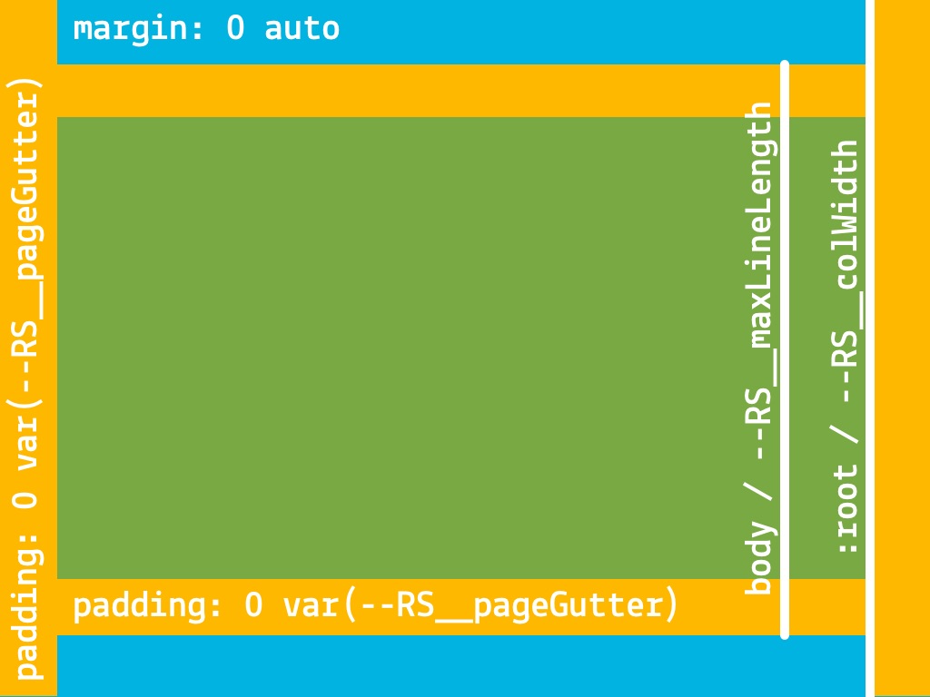
The RS owns :root and part of body
Since we must inject contents and columns are implemented at the :root level (i.e. html), the Reading System owns the entire styling for this selector.
Font size is an important metric since the responsive design relies entirely on rem (root em) so this style must be enforced by any means necessary.
For body, we own:
overflow;- sizing:
(min-|max-)width,(min-|max-)height,box-sizing; - spacing:
marginandpadding.
You can control horizontal margins in several ways:
- using
column-gapandpaddingfor:root; - using
column-gapandmarginfor the web view/chrome view/iframe; - using
paddingfor:rootand/orbody.
Please note that when using padding, you must take it into account when sizing :root and/or body. Their widths contain the padding set for the element.
The auto pagination model
By default, responsive columns are built into Readium CSS, which means the layout will automatically switch from a single page to a two-column spread depending on:
- the size of the viewport (by default, the minimum
widthis60emor the mobile device is in landscape orientation); - the
font-sizecurrently set by the user.
The spread will consequently switch to a single page once the user sets a font-size which is too large for two columns.
The following illustrations are the two models you’ll have to deal with.
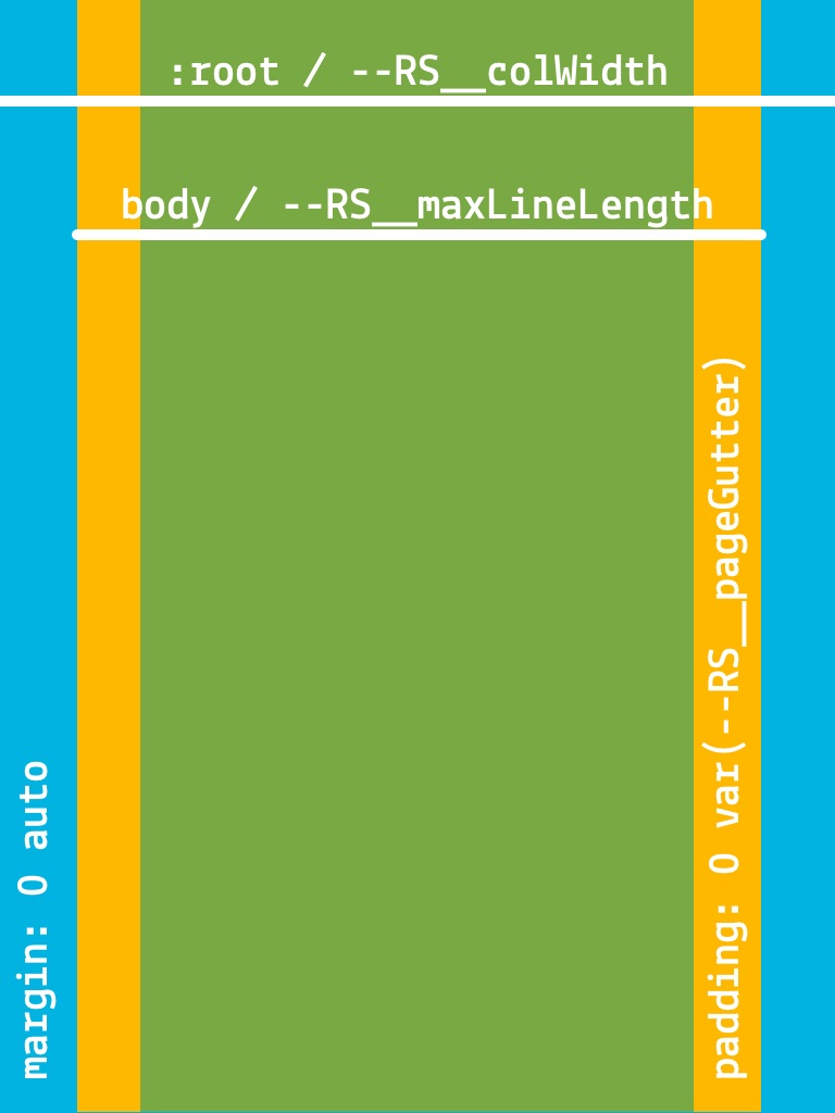
A single page is just a column which can grow to the entire width of the web view/iframe since it is declared for html.
Page margins are part of body, hence --RS__maxLineLength. Contents are centered using the auto value for body margins.
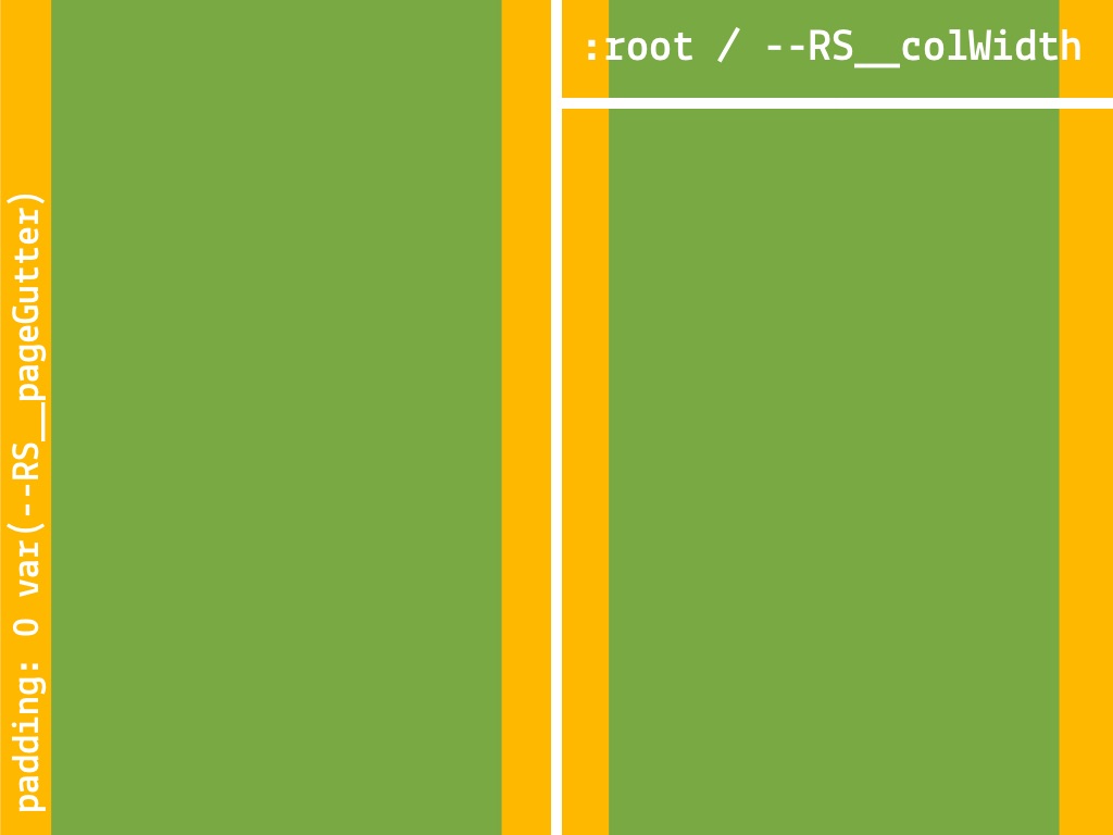
In the spread model, i.e. two columns, the --RS__colWidth is a floor: once the minimum width available (viewport) can’t contain 2 columns (the value is computed from the font-size user setting), we switch to the single page model.
For instance, if --RS__colWidth is 20em and the font-size, 100% (16px), then the floor is 320px. If 2 columns can fit in the viewport, the spread model is applied. If they can’t, the page model is applied. Hence, if the user sets the font-size at 200% (32px), the floor is 640px, which means the viewport should be at least 1240px-wide to apply the spread model.
Since we still limit line-length in the spread model, you might want to limit the web view/iframe size so that you don’t end up with wide gaps on large screens (or add padding to :root, and take it into account when scrolling).
Variables you can set
Please note those variables’ value can be redefined using media queries. You don’t need to redeclare entire declarations.
--RS__colWidth
The optimal column’s width. It serves as a floor in our design.
It must not be set in rem as there is currently a bug with this unit in some implementations (the em unit is fine).
--RS__colCount
The optimal number of columns (depending on the columns’ width).
--RS__colGap
The gap between columns. It must be set in pixels so that it won’t resize with font size.
You must account for this gap when scrolling.
--RS__pageGutter
The horizontal page margins. It must be set in pixels so that it won’t resize with font size.
--RS__maxLineLength
The optimal line-length. It must be set in rem in order to take :root’s font-size as a reference, whichever the body’s font-size might be.
Right-to-left progression
The auto pagination model will take care of itself if the correct dir attribute is set on html and body.
In other words, if dir="rtl" is set for both elements, the column-progression will be automatically reversed.
When to use the Right-to-left progression
What implementers need to do:
- check the
page-progression-directionfor thespineitem; - check the language – do not forget there can be multiple
<dc:language>items; - load specific styles for RTL scripts;
- append
xml:langand/orlangattribute if it’s missing in XHTML documents; - append
dir="rtl"attributes if they’re missing for bothhtmlandbodyin XHTML documents; - load specific fonts’ lists for user settings, based on the primary language of the publication;
- add/remove specific user settings, based on the primary language of the publication;
- Apply the correct
page-progression-direction(in RTL, next resource is on the left, previous is on the right); - change the direction of the toc and at least some pieces of user settings (e.g.
text-align).
The current implementation is limited to the following combinations:
| Language | IANA tag | page-progression-direction | dir attribute |
|---|---|---|---|
| Arabic | ar | RTL | rtl |
| Farsi (Persian) | fa | RTL | rtl |
| Hebrew | he | RTL | rtl |
IANA Language Subtag registery.
We may add others at some point in the future. Please feel free to report the languages or scripts missing in this mapping. Please bear in mind a list of default (preferably system) fonts will greatly help to add support for those languages and scripts. See Default Fonts.
Test files can be retrieved from the Readium CSS’ i18n-samples OPDS feed.
Be cautious, the direction propagates
As explicitly stated in CSS Writing Modes Level 3:
As a special case for handling HTML documents, if the
:rootelement has a<body>child element, the principal writing mode is instead taken from the values ofwriting-modeanddirectionon the first such child element instead of taken from the root element.
What this means is that the dir attribute (or the direction CSS property) set for body will override the one set for html. Unlike most other CSS properties, which don’t impact the parent element, the dir attribute (or the direction CSS property) propagates in this very specific case:
<html dir="ltr">
  <body dir="rtl">
   <!-- dir="rtl" should be used. -->
html {
  direction: ltr;
}

body {
  direction: rtl;
  /* rtl propagates to html and overrides ltr.
     You can think of it as a JS event bubbling up if that makes more sense. */
}
We MUST consequently force the direction for all documents in the publication, and can’t manage ltr documents in a rtl publication.
Note: While this isn’t necessarily the case in practice, in Blink, Gecko/Quantum and Webkit, and you can emulate a reversed column-progression for ltr documents in a rtl publication, this behavior may change in the future.
The pagination model for vertical writing modes
When publications are in Chinese, Japanese, Korean, and Mongolian, and laid out with a vertical-* writing mode, we must switch to a different model since we can’t do a two-column spread.
Indeed, columns are automatically laid out on the y-axis (vertical) with such writing modes, and the behavior of multi-column in orthogonal flows has been deferred to CSS Writing Modes Level 4.
We consequently use a “Fragmented Model”, as it differs significantly from the “Pagination Model”, especially the column-axis.
One can think of the fragmented model as the single page model rotated 90% clockwise. The only difference is that padding is added to the :root (html) element so that text doesn’t run from edge to edge.
Other options have been explored, e.g. a pseudo-algorithm mimicking margin: auto, using the calc() function, but it proved complex to manage well and raised serious performance issues, especially when resizing the window of a browser with documents making heavy use of text-direction and text-combine-upright.
When to use the fragmented model
What implementers need to do:
- check the
page-progression-directionfor thespineitem; - check the language – do not forget there can be multiple
<dc:language>items; - load the specific styles for CJK if needed;
- append
xml:langand/orlangattribute if it’s missing in XHTML documents; - load specific fonts’ lists for user settings, based on the primary language of the publication;
- add/remove specific user settings, based on the primary language of the publication;
- Apply the correct page-progression-direction (in RTL, next resource is on the left, previous is on the right).
Here is the correct mapping for combinations resulting in the vertical-* writing mode:
| Language | IANA tag | page-progression-direction | Writing-mode |
|---|---|---|---|
| Chinese | zh | RTL | vertical-rl |
| Chinese (Traditional) | zh-Hant | RTL | vertical-rl |
| Chinese (Taiwan) | zh-TW | RTL | vertical-rl |
| Chinese (Hong Kong) | zh-HK | RTL | vertical-rl |
| Korean | ko | RTL | vertical-rl |
| Japanese | ja | RTL | vertical-rl |
| Mongolian | mn-Mong | LTR / Default / None | vertical-lr |
IANA Language Subtag registery.
Test files can be retrieved from the Readium CSS’ i18n-samples OPDS feed.
When not to use the fragmented model
If a publication doesn’t need to be laid out in a vertical-* writing mode, the auto pagination model can be used.
There are still specific styles for CJK Horizontal to load though.
Here is the correct mapping for combinations resulting in the horizontal-tb writing mode:
| Language | IANA tag | page-progression-direction | Writing-mode |
|---|---|---|---|
| Chinese | zh | LTR / Default / None | horizontal-tb |
| Chinese (Simplified) | zh-Hans | LTR / Default / None | horizontal-tb |
| Chinese (Taiwan) | zh-TW | LTR / Default / None | horizontal-tb |
| Chinese (Hong Kong) | zh-HK | LTR / Default / None | horizontal-tb |
| Korean | ko | LTR / Default / None | horizontal-tb |
| Japanese | ja | LTR / Default / None | horizontal-tb |
| Mongolian | mn-Cyrl | LTR / Default / None | horizontal-tb |
IANA Language Subtag registery.
Be cautious, the writing-mode CSS property propagates
As explicitly stated in CSS Writing Modes Level 3:
As a special case for handling HTML documents, if the
:rootelement has a<body>child element, the principal writing mode is instead taken from the values ofwriting-modeanddirectionon the first such child element instead of taken from the root element.
What this means is that the writing-mode declared for body will override the one declared for html. Unlike most other CSS properties, which don’t impact the parent element, writing-mode propagates in this very specific case:
html {
  writing-mode: horizontal-tb;
}

body {
  writing-mode: vertical-rl;
  /* vertical-rl propagates to html and overrides horizontal-tb.
     You can think of it as a JS event bubbling up if that makes more sense. */
}
We MUST consequently force the writing-mode for all documents in the publication, and can’t manage horizontal-tb documents in a vertical-rl publication.
Patch and safeguards
We’ve designed two extras for pagination:
- a patch for HTML5 Suggested Rendering, which takes care of paged media;
- safeguards, which make sure some elements will be managed as expected by authors in columns.
Patch
The HTML5 patch deals with:
- fragmentation (
widows,orphansandpage-break); - hyphenation;
- open type features;
- horizontal margins (pixels have been converted to %);
- normalization of
abbrandwbr.
You can use it with or without pagination, it should not make any difference.
Safeguards
Safeguards deal with:
- media sizing (e.g.
img,svg,audio,video); - word wrap for long strings (headings and links);
- large table’s overflow.
Once again, you can use it with or without pagination, it should not make any difference.
Variables you can set
--RS__maxMediaWidth
The max-width for media elements i.e. img, svg, audio and video.
--RS__maxMediaHeight
The max-height for media elements i.e. img, svg, audio and video.
--RS__boxSizingMedia
The box model (box-sizing) you want to use for media elements.
--RS__boxSizingTable
The box model (box-sizing) you want to use for tables.