readium-css
Defaults
[Implementers’ doc] [Authors’ info]
Defaults is currently made of 5 stylesheets:
- 1 base stylesheet for all ebooks;
- 1 default reading mode stylesheet for all ebooks (day mode);
- 1 default stylesheet for unstyled ebooks;
- 1 stylesheet to deal with the OS’ a11y modes.
Note: The default stylesheet should not be appended if there are author styles in the EPUB file.
Base
The base stylesheet deals with:
- default typography;
- default font-family depending on the language.
Those values are obviously customizable.
It should be appended before any author’s stylesheet.
Variables you can set
Default font-stacks
--RS__oldStyleTf
An old style serif font-stack relying on pre-installed fonts.
Default is "Iowan Old Style", "Sitka Text", Palatino, "Book Antiqua", serif.
--RS__modernTf
A modern serif font-stack relying on pre-installed fonts.
Default is Athelas, Constantia, Georgia, serif.
--RS__sansTf
A neutral sans-serif font-stack relying on pre-installed fonts.
Default is -apple-system, system-ui, BlinkMacSystemFont, "Segoe UI", Roboto, "Helvetica Neue", Arial, sans-serif.
--RS__humanistTf
A humanist sans-serif font-stack relying on pre-installed fonts.
Default is Seravek, Calibri, Roboto, Arial, sans-serif.
--RS__monospaceTf
A monospace font-stack relying on pre-installed fonts.
Default is "Andale Mono", Consolas, monospace.
Default font-stacks for Japanese publications
We’ve been trying to follow the recommendations of the EBPAJ File Creation Guide and provide specific font-stacks that can handle both horizontal and vertical writing.
Those font-stacks have been modeled after fonts the templates of this guide use as defaults, and extend support to the largest amount of platforms possible.
--RS__serif-ja
A Mincho font-stack whose fonts with proportional latin characters are prioritized for horizontal writing.
Fonts are not necessarily pre-installed, which is the reason why this font-stack is extensive.
Default is "Hiragino Mincho ProN", "Hiragino Mincho Pro", "YuMincho", "BIZ UDPMincho", "Yu Mincho", "MS P明朝", "MS PMincho", serif.
--RS__sans-serif-ja
A Gothic font-stack whose fonts with proportional latin characters are prioritized for horizontal writing.
Fonts are not necessarily pre-installed, which is the reason why this font-stack is extensive.
Default is "Hiragino Sans", "Hiragino Kaku Gothic ProN", "Hiragino Kaku Gothic Pro", "ヒラギノ角ゴ W3", "YuGothic", "Yu Gothic Medium", "BIZ UDPGothic", "Yu Gothic", "MS Pゴシック", "MS PGothic", sans-serif.
--RS__serif-ja-v
A Mincho font-stack whose fonts with fixed-width latin characters are prioritized for vertical writing.
Fonts are not necessarily pre-installed, which is the reason why this font-stack is extensive.
Default is "Hiragino Mincho ProN", "Hiragino Mincho Pro", "YuMincho", "BIZ UDMincho", "Yu Mincho", "MS明朝", "MS Mincho", serif.
--RS__sans-serif-ja-v
A Gothic font-stack whose fonts with fixed-width latin characters are prioritized for vertical writing.
Fonts are not necessarily pre-installed, which is the reason why this font-stack is extensive.
Default is "Hiragino Sans", "Hiragino Kaku Gothic ProN", "Hiragino Kaku Gothic Pro", "ヒラギノ角ゴ W3", "YuGothic", "Yu Gothic Medium", "BIZ UDGothic", "Yu Gothic", "MSゴシック", "MS Gothic", sans-serif.
Absolute defaults for all ebooks
--RS__baseFontFamily
The default typeface for body copy in case the ebook doesn’t have one declared.
Please note some languages have a specific font-stack (japanese, chinese, hindi, etc.)
--RS__baseLineHeight
The default line-height for body copy in case the ebook doesn’t have one declared.
We’re using an algorithm to find the ideal line-height for the current font based on its metrics (see details in the next subsection below).
--RS__lineHeightCompensation
The compensation factor (integer) the dynamic leading pseudo-algorithm must apply, if used. Default is 1 i.e. no compensation.
This variable is redefined by default, in languages and scripts which need compensation due to the characteristics of their average fonts’ metrics.
Dynamic leading (line-height)
If we don’t provide a base line-height and the author hasn’t explicitely set one, then the normal value will be applied. On average, it is less than 1.2, which makes leading quite solid and can quickly become a readability issue with some fonts, especially the ones with a large x-height.
Readium CSS consequently uses an algorithm to find the ideal leading for each font by default (with a fallback value accomodating every script/language it supports).
This algorithm tries to:
- automagically adjust the
line-heightto the current typeface; - adjust this ideal
line-heightit has just computed to the currentfont-sizethe user has set.
calc((1em + (2ex - 1ch) - ((1rem - 16px) * 0.1667)) * var(--RS__lineHeightCompensation))
In which, --RS__lineHeightCompensation is a factor whose default is 1. Indeed, the line-height is usually 15–20% larger in CJK than in other scripts/languages (factor of 1.167), but it can also used for square-ish fonts, especially in Indic.
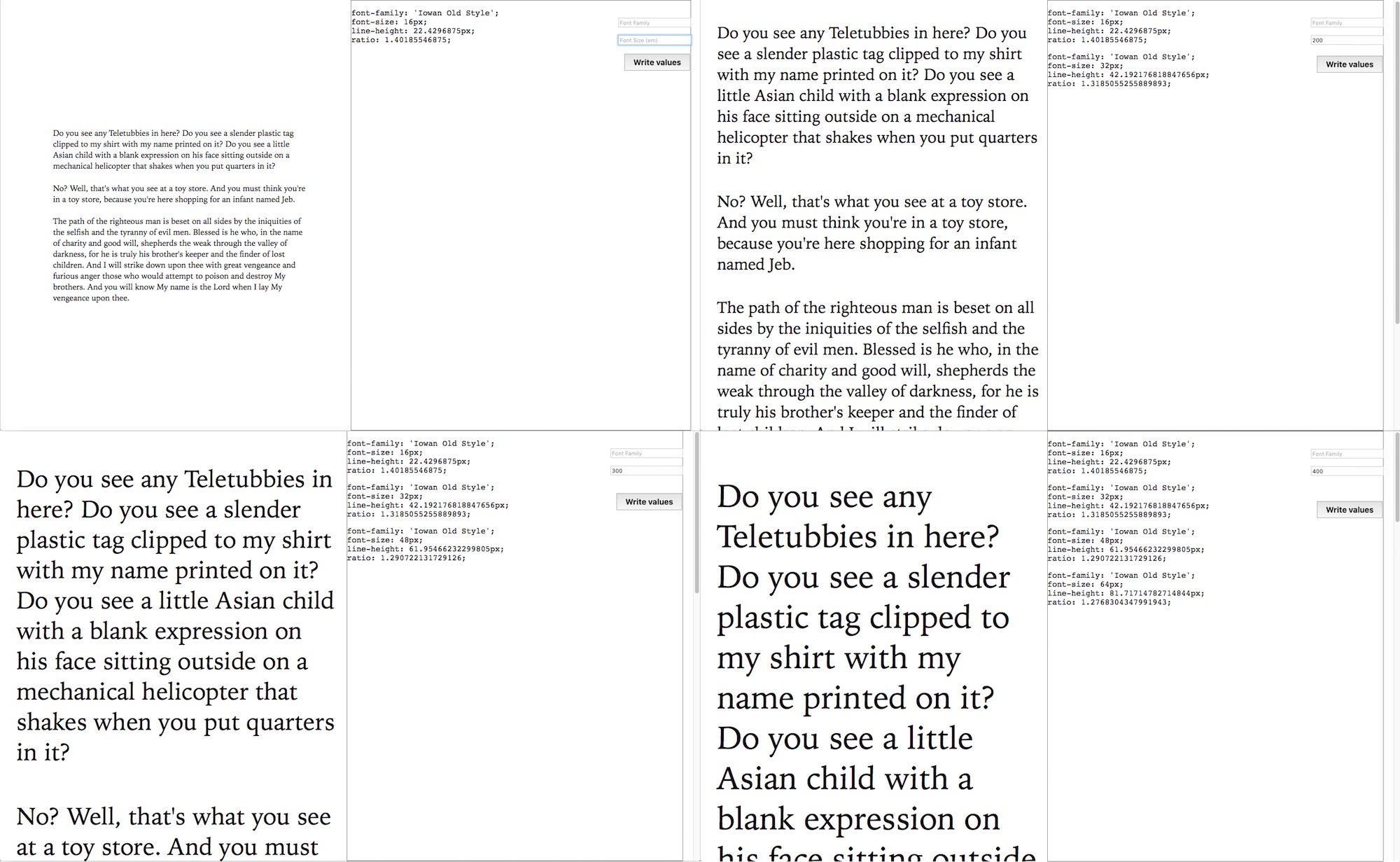
The results we could get for the vast majority of fonts can be described as good in terms of typographic color. Here is Iowan Old Style for instance.
This isn’t a perfect solution though, and this algorithm may be revisited in the future.
See Further Details for an extensive explanation.
Day Mode
The ReadiumCSS-day_mode.css stylesheet serves as a default and handles background-color and color for :root and ::selection.
Variables you can set
--RS__backgroundColor
The background-color for the entire viewport.
--RS__textColor
The color for body copy.
--RS__selectionBackgroundColor
The background-color for selected text.
It is worth noting it can be customized for each reading mode.
--RS__selectionTextColor
The color for selected text.
It is worth noting it can be customized for each reading mode.
Default
The default stylesheet was designed for unstyled ebooks. It is based on HTML5 Suggested Rendering and can be customized.
Although it must not be used for styled ebooks, it should not impact the author’s styles if it is added before its stylesheet(s).
You can customize:
- the typeface for headings (body is in
base.css); - the typeface for code;
- the font-size for body copy;
- the base line-height for all elements;
- the vertical margins for block elements;
- the vertical margins for paragraphs;
- the text-indent for paragraphs;
- the typescale;
- the color for links (including visited);
- a primary accent color (unused by default);
- a secondary accent color (unused by default).
It makes use of a typescale so that you can change it dynamically (depending on page size, font size, etc.) so that headings and other elements can be adjusted.
Variables you can set
Typefaces
--RS__compFontFamily
The typeface for headings. The value can be another variable e.g. var(-RS__humanistTf).
--RS__codeFontFamily
The typeface for code snippets. The value can be another variable e.g. var(-RS__monospaceTf).
Typography
--RS__typeScale
The scale to be used for computing all elements’ font-size. Since those font sizes are computed dynamically, you can set a smaller type scale when the user sets one of the largest font sizes.
Possible values: 1 |
1.067 |
1.125 |
1.2 (suggested default) |
1.25 |
1.333 |
1.414 |
1.5 |
1.618 |
--RS__baseFontSize
The default font-size for body copy. It will serve as a reference font all related computations.
--RS__baseLineHeight
The default line-height for all elements.
Vertical rhythm
--RS__flowSpacing
The default vertical margins for HTML5 flow content e.g. pre, figure, blockquote, etc.
--RS__paraSpacing
The default vertical margins for paragraphs.
--RS__paraIndent
The default text-indent for paragraphs.
Hyperlinks
--RS__linkColor
The default color for hyperlinks.
--RS__visitedColor
The default color for visited hyperlinks.
Accentuation colors
--RS__primaryColor
An optional primary accentuation color you could use for headings or any other element of your choice.
--RS__secondaryColor
An optional secondary accentuation color you could use for any element of your choice.
OS’ a11y modes
This stylesheet is intended to deal with a11y settings users can set at the OS level, whenever possible:
- high-contrast mode;
- inverted colors;
- monochrome;
- reduced motion.
For monochrome, we’ll have to adjust reading modes (night, sepia, etc.) in their specific stylesheet; we’ll see if we can at least manage some more global settings in there.