readium-css
Open Source and Libre Fonts We Can Recommend
[Implementers’ doc] [WIP]
While we recommend using system fonts to get the best performance whenever possible, implementers might want to use Open Source Fonts to offer more choice to users. On the Android platform, for instance, system fonts are limited to one typeface per generic family (serif, sans-serif, fantasy, monospace, and cursive), which means implementers don’t get a lot of options out of the box.
Consequently, amongst the thousands of fonts available online, a pre-selection of 28 typefaces have been reviewed extensively. Those typefaces were selected based on multiple factors:
- they have enough styles (at least the 4 “core styles” i.e.
regular,italic,bold,bold italic) so that implementers don’t break authors’ expectations; - they can be used in body copy;
- they are designed with quality screen rendering in mind;
- they can be free alternatives to system fonts available on other platforms;
- they offer good-enough support for at least latin-based languages.
Here’s the complete list of those 28 fonts:
- Alegreya
- Bitter
- Charis SIL
- Clear Sans
- Crimson Text
- DejaVu Sans
- Faustina
- Fira Sans
- Gandhi Sans
- Gandhi Serif
- Gentium Book Basic
- Heuristica
- IBM Plex Sans
- IBM Plex Serif
- Libre Franklin
- Literata
- Lora
- Merriweather Sans
- Merriweather Serif
- Proza Libre
- PT Sans
- PT Serif
- Rosario
- Rubik
- Source Sans Pro
- Spectral
- Volkhov
- Vollkorn
How were those fonts reviewed
Each of the 28 fonts has been undergoing tests in real rendering situations.
They were rendered on the Android, iOS, MacOS, and Windows platforms, using SD and HD displays when possible, in multiple browsers (IE11, Edge, Safari, Chrome, Firefox), and in different reading modes (day, sepia, night).
Then each font was:
- compared to its closest reference (system font);
- tested against the latin, cyrillic and greek alphabets and languages;
- tested against the small capitals and numeric OpenType features.
Note: For some reason, a lot of Google Fonts don’t have the “™” character. Font stacks should consequently be fine-tuned so that this character doesn’t disrupt the reading experience.
Results
It is important to state that implementers can’t really go wrong with those 27 fonts.
We sometimes forget that users can’t necessarily afford bleeding-edge technology, which is why it was important to review those fonts in various conditions.
The 12 recommended fonts are simply providing the best rendering in the worst situations possible (Windows ClearType on a mediocre screen), and the best language support as well. If you don’t have to support Windows, for instance, then you can try fonts which are not recommended.
For your information, here are the results for Windows ClearType rendering at 1em (or 100%).
Buggy
- IBM Plex Sans (will become excellent once hinting issues are fixed)
Mediocre
- Alegreya
- Crimson Text (but supports latin + cyrillic + greek)
- Lora
- Spectral (using weight +100 might help e.g. medium as regular and extrabold as bold)
Average
- DejaVu Sans
- Faustina (Average+)
- Gentium Book Basic
- Heuristica
- Volkhov
Good
- Bitter (the Google Fonts version was reviewed but the FontSquirrel version is more complete)
- Charis SIL
- Gandhi Serif
- Literata
- PT Sans
- PT Serif
- Rubik
- Source Sans Pro
- Vollkorn
Excellent
- Clear Sans
- Fira Sans
- Gandhi Sans
- IBM Plex Serif
- Merriweather Sans
- Merriweather Serif
- Proza Libre
- Rosario
Recommended Typefaces
An extended selection of 13 typefaces are recommended to offer implementers some flexibility. With an extended solution, it is likely that all apps leveraging Readium CSS won’t end up using the same exact selection.
Note: Supported Languages focus on diacritics. Support for languages using the latin alphabet, like English, is implied.
Serif fonts
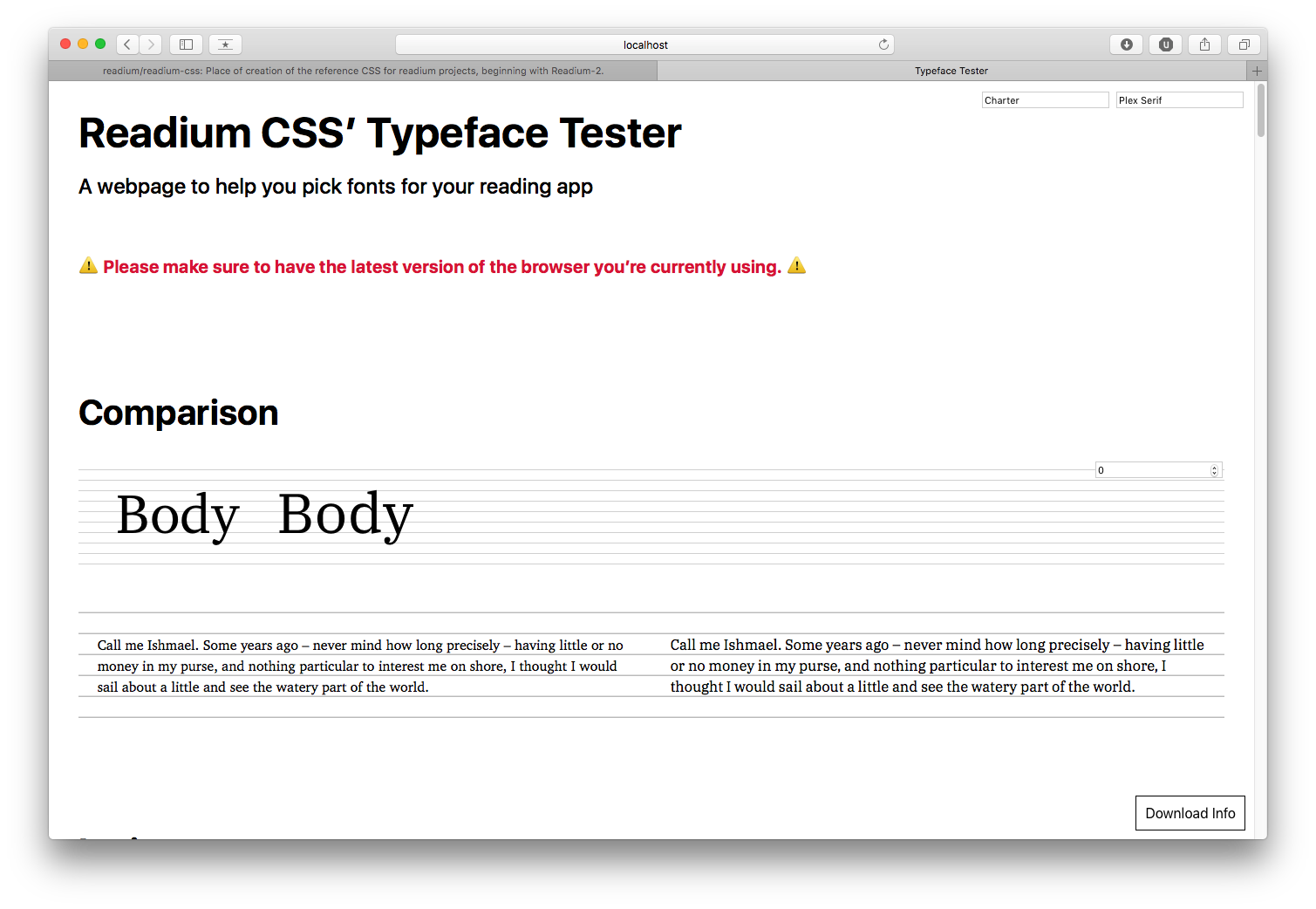
Charis SIL

Global info:
- Source: https://software.sil.org/charis/
- Google Fonts: NO
- Design: SIL International
- License: SIL-OFL
Technical details:
- Reference: Charter
- Classification: Slab
- Styles: 4
- Metrics:
- Contrast: TBD
- x-height: TBD
- weight: TBD
- width: TBD
Supported Languages: Albanian, Bosnian, Czech, Danish, Dutch, Estonian, Finnish, French, German, Hungarian, Italian, Latvian, Lithuanian, Norwegian, Polish, Portuguese, Romanian, Slovak, Slovenian, Spanish, Swedish, Turkish, Cyrillic.
OpenType Features: none.
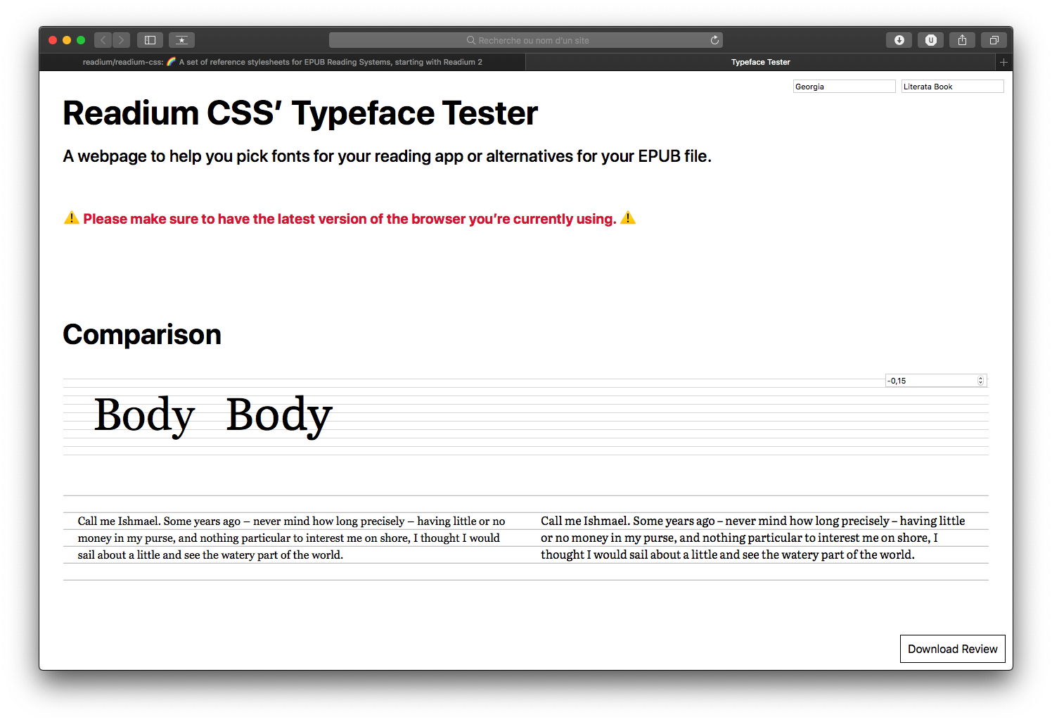
Faustina

Global info:
- Source: https://github.com/Omnibus-Type/Faustina
- Google Fonts: YES
- Design: Omnibus Type
- License: SIL-OFL
Technical details:
- Reference: Bookerly
- Classification: Slab
- Styles: 8
- Metrics:
- Contrast: 0.39
- x-height: 0.76
- weight: 0.06
- width: 0.45
Supported Languages: Albanian, Bosnian, Czech, Danish, Dutch, Estonian, Finnish, French, German, Hungarian, Italian, Latvian, Lithuanian, Norwegian, Polish, Portuguese, Romanian, Slovak, Slovenian, Spanish, Swedish, Turkish.
OpenType Features: none.
IBM Plex Serif
Global info:
- Source: https://github.com/IBM/type
- Google Fonts: Not Yet
- Design: IBM
- License: SIL-OFL
Technical details:
- Reference: Georgia, Droid Serif
- Classification: Modern
- Styles: 6
- Metrics:
- Contrast: TBD
- x-height: TBD
- weight: TBD
- width: TBD
Supported Languages: Albanian, Bosnian, Czech, Danish, Dutch, Estonian, Finnish, French, German, Hungarian, Italian, Latvian, Lithuanian, Norwegian, Polish, Portuguese, Romanian, Slovak, Slovenian, Spanish, Swedish, Turkish.
OpenType Features: none.
Literata
Global info:
- Source: https://github.com/googlefonts/literata
- Google Fonts: YES
- Design: TypeTogether
- License: SIL-OFL
Technical details:
- Reference: Georgia, Droid Serif
- Classification: Modern, Slab
- Styles: 8
- Metrics:
- Contrast: TBD
- x-height: TBD
- weight: TBD
- width: TBD
Supported Languages: Albanian, Bosnian, Czech, Danish, Dutch, Estonian, Finnish, French, German, Hungarian, Italian, Latvian, Lithuanian, Norwegian, Polish, Portuguese, Romanian, Slovak, Slovenian, Spanish, Swedish, Turkish, Cyrillic, Greek.
OpenType Features: small caps, numeric figure values, numeric spacing values.
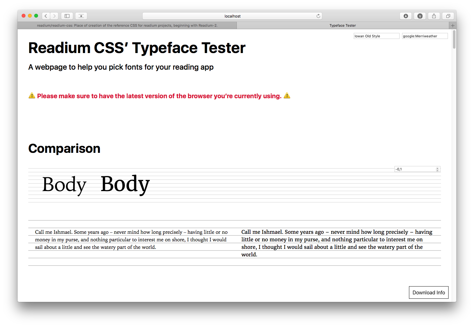
Merriweather
Global info:
- Source: https://fonts.google.com/specimen/Merriweather
- Google Fonts: YES
- Design: Sorkin Type Co
- License: SIL-OFL
Technical details:
- Reference: Iowan Old Style
- Classification: Modern (but must be mapped to Iowan Old Style because of its metrics)
- Styles: 8
- Metrics:
- Contrast: 0.51
- x-height: 0.75
- weight: 0.08
- width: 0.52
Supported Languages: Albanian, Bosnian, Czech, Danish, Dutch, Estonian, Finnish, French, German, Hungarian, Italian, Latvian, Lithuanian, Norwegian, Polish, Portuguese, Romanian, Slovak, Slovenian, Spanish, Swedish, Turkish, Cyrillic.
OpenType Features: none.
PT Serif

Global info:
- Source: https://fonts.google.com/specimen/PT+Serif
- Google Fonts: YES
- Design: ParaType
- License: Paratype PT Serif Free Font License
Technical details:
- Reference: Charter
- Classification: Slab
- Styles: 4 (+ 2 for captions)
- Metrics:
- Contrast: 0.55
- x-height: 0.71
- weight: 0.06
- width: 0.47
Supported Languages: Albanian, Bosnian, Czech, Danish, Dutch, Estonian, Finnish, French, German, Hungarian, Italian, Latvian, Lithuanian, Norwegian, Polish, Portuguese, Romanian, Slovak, Slovenian, Spanish, Swedish, Turkish, Cyrillic.
OpenType Features: none.
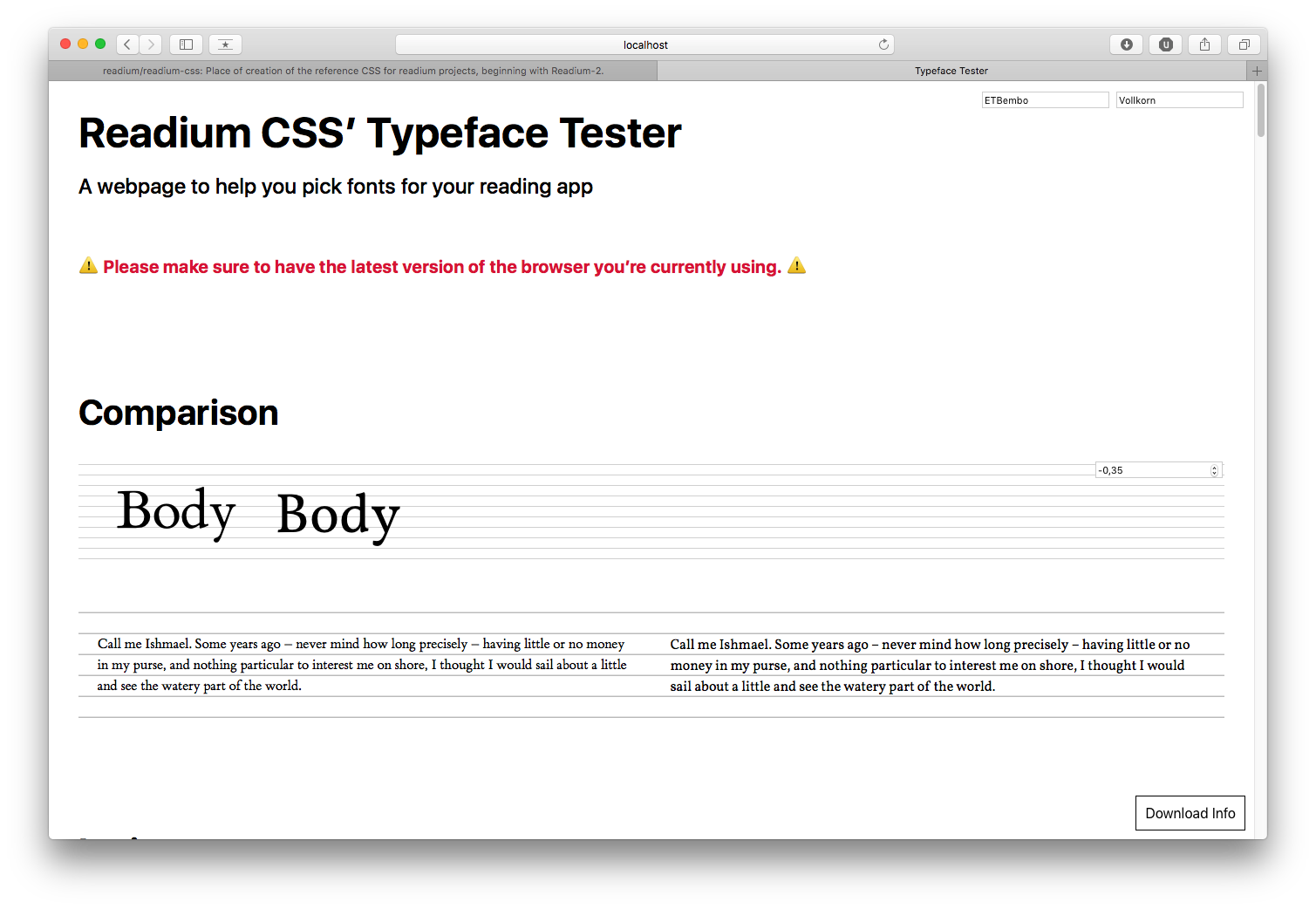
Vollkorn
Global info:
- Source: http://vollkorn-typeface.com
- Google Fonts: YES
- Design: Friedrich Althausen
- License: SIL-OFL
Technical details:
- Reference: Athelas, Bembo
- Classification: Modern
- Styles: 8
- Metrics:
- Contrast: 0.53
- x-height: 0.68
- weight: 0.06
- width: 0.45
Supported Languages: Albanian, Bosnian, Czech, Danish, Dutch, Estonian, Finnish, French, German, Hungarian, Italian, Latvian, Lithuanian, Norwegian, Polish, Portuguese, Romanian, Slovak, Slovenian, Spanish, Swedish, Turkish, Cyrillic.
OpenType Features: small caps, numeric figure values, numeric spacing values (and more).
Sans-serif fonts
Clear Sans
Global info:
- Source: https://01.org/clear-SANS
- Google Fonts: NO
- Design: Intel
- License: Apache 2.0
Technical details:
- Reference: Trebuchet MS
- Classification: Sans
- Styles: 8
- Metrics:
- Contrast: TBD
- x-height: TBD
- weight: TBD
- width: TBD
Supported Languages: Albanian, Bosnian, Czech, Danish, Dutch, Estonian, Finnish, French, German, Hungarian, Italian, Latvian, Lithuanian, Norwegian, Polish, Portuguese, Romanian, Slovak, Slovenian, Spanish, Swedish, Turkish, Cyrillic, Greek.
OpenType Features: none.
Fira Sans

Global info:
- Source: https://github.com/mozilla/Fira
- Google Fonts: YES
- Design: Carrois Apostrophe for Mozilla
- License: SIL-OFL
Technical details:
- Reference: Seravek
- Classification: Humanist
- Styles: 18
- Metrics:
- Contrast: 0.25
- x-height: 0.76
- weight: 0.07
- width: 0.42
Supported Languages: Albanian, Bosnian, Czech, Danish, Dutch, Estonian, Finnish, French, German, Hungarian, Italian, Latvian, Lithuanian, Norwegian, Polish, Portuguese, Romanian, Slovak, Slovenian, Spanish, Swedish, Turkish, Cyrillic, Greek.
OpenType Features: none.
Libre Franklin

Global info:
- Source: https://github.com/impallari/Libre-Franklin
- Google Fonts: YES
- Design: Impallari Type
- License: SIL-OFL
Technical details:
- Reference: Franklin Gothic
- Classification: Sans
- Styles: 18
- Metrics:
- Contrast: 0.28
- x-height: 0.71
- weight: 0.07
- width: 0.44
Supported Languages: Albanian, Bosnian, Czech, Danish, Dutch, Estonian, Finnish, French, German, Hungarian, Italian, Latvian, Lithuanian, Norwegian, Polish, Portuguese, Romanian, Slovak, Slovenian, Spanish, Swedish, Turkish.
OpenType Features: none.
Merriweather Sans

Global info:
- Source: https://fonts.google.com/specimen/Merriweather+Sans
- Google Fonts: YES
- Design: Sorkin Type Co
- License: SIL-OFL
Technical details:
- Reference: San Fransisco, Roboto
- Classification: Sans
- Styles: 8
- Metrics:
- Contrast: 0.30
- x-height: 0.75
- weight: 0.08
- width: 0.45
Supported Languages: Albanian, Bosnian, Czech, Danish, Dutch, Estonian, Finnish, French, German, Hungarian, Italian, Latvian, Lithuanian, Norwegian, Polish, Portuguese, Romanian, Slovak, Slovenian, Spanish, Swedish, Turkish.
OpenType Features: none.
PT Sans
Global info:
- Source: https://fonts.google.com/specimen/PT+Sans
- Google Fonts: YES
- Design: ParaType
- License: Paratype PT Sans Free Font License
Technical details:
- Reference: Seravek
- Classification: Humanist
- Styles: 4 (+ 2 for captions + 2 for narrow)
- Metrics:
- Contrast: 0.16
- x-height: 0.71
- weight: 0.06
- width: 0.39
Supported Languages: Albanian, Bosnian, Czech, Danish, Dutch, Estonian, Finnish, French, German, Hungarian, Italian, Latvian, Lithuanian, Norwegian, Polish, Portuguese, Romanian, Slovak, Slovenian, Spanish, Swedish, Turkish, Cyrillic.
OpenType Features: none.
Source Sans Pro
Global info:
- Source: https://github.com/adobe-fonts/source-sans-pro
- Google Fonts: YES
- Design: Adobe
- License: SIL-OFL
Technical details:
- Reference: Seravek
- Classification: Humanist
- Styles: 12
- Metrics:
- Contrast: 0.20
- x-height: 0.74
- weight: 0.06
- width: 0.39
Supported Languages: Albanian, Bosnian, Czech, Danish, Dutch, Estonian, Finnish, French, German, Hungarian, Italian, Latvian, Lithuanian, Norwegian, Polish, Portuguese, Romanian, Slovak, Slovenian, Spanish, Swedish, Turkish.
OpenType Features: numeric figure values.
Windows
Microsoft has been investing a lot of resources in designing fonts that render perfectly on this platform, especially with ClearType. Typefaces like Cambria, Constantia, Arial Nova, Georgia Pro, Sitka, Verdana Pro, and more, offer a large amount of styles, excellent language support, extensive support of Open Type features, and high quality rendering, even on mediocre screens.
As a consequence, we strongly recommend prioritizing such system fonts for the core selection and using Open Source fonts as extras. A list of system fonts available can be found in Microsoft Typography docs.
Recommended fonts for Accessibility
ReadiumCSS is shipping with 2 a11y-related fonts to be found in the dist/fonts folder:
- AccessibleDfA, by Orange;
- IA Writer Duospace, by iA.
Those fonts should be applied by those exact names as we need very precise fallbacks for missing characters. We may create variables in the future, once those fonts have been properly reviewed and validated.
We can also recommend Open Dyslexic, either in addition to or replacement of AccessibleDfa.
Recommended fonts for CJK
In addition to Google Noto Fonts, we can currently recommend:
- Adobe Source Han Sans;
- Adobe Source Han Serif;
- KoPub fonts for Korean.
Recommended fonts for Hebrew
In addition to Google Noto Fonts, we can currently recommend:
Recommended fonts for Arabic and Persian
In addition to Google Noto Fonts, we can currently recommend:
Recommended fonts for Indic
In addition to Google Noto Fonts, we can currently recommend:
- Catamaran (Tamil script);
- Hind Family (Bengali, Devanagari, Gujarati, Gurmukhi, Kannada, Malayalam, Sinhalese, Tamil, and Telugu scripts);
- Mukta Family (Devanagari, Gujarati, Gurumukhi and Tamil scripts);
- Vesper Libre (Devanagari script).